
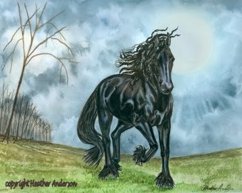
I agree with what I've read and heard about the various colours. For the most part, the earth colours, the blues, and the yellows are quite friendly and agreeable, although the granulating colours within those groups can get a bit tricky. But the greens and reds can be bullies if you are not careful. Green can get over-GREEN or go acid very quickly if you are not careful, while red can get very heavy very fast, and it's also rather mobile if you accidentally sweep the edges with water, and you'll end up with colours running where you don't want them. True of any colour of course, if the situation is right, but I've had the most trouble that way, with red. Handled skillfully, these colours glow, and I am still working on getting a glorious, glowing red. Baby steps - red insists on taking baby steps.

With all the juicy colours dancing on the palette, it's tempting to boldly sweep it everywhere, but some restraint is necessary if you want your subject to stand out. You have to make a difference in the colour and amount of detail if you want any one thing to become the main focus. And the eye needs a place to rest - a place where the colour is quieter and the detail fades away. You want to dazzle the viewer, not blind them :D

I'm still working on these things and I always will be. There's always something new to learn and something you can do better. And isn't that GREAT!!
Cheers,
Heather
www.heatheranderson-animalart.com
No comments:
Post a Comment