There is a wonderful saying in French that translates loosely as "Comfortable in my own skin". I think that's an important thing for an artist to feel. After years of wondering how I should look, how my art should look, I finally did get comfortable. Maybe it started with my horse, because when I was with him, I was no fashion plate, with wind tossed hair and faded jeans pockets stuffed to overflowing with apples for treats and Kleenex to wipe his often runny eyes. And I was as happy as could be!
The painting comfort was a little slower to come together. For so many years I felt I needed the validation of art shows and competitions. I was part of a great many art shows and never really enjoyed them, and was accepted into a good number of competitions, and even won some ribbons, but there was never the expected rush of "WOW! I DID IT!!" Instead, it was always a case of, "Well OK, I'd better get the painting ready to ship", or "that's nice, a ribbon". So why was I going to the effort and expense to enter these things?
Maybe it was simply time that brought me to the conclusion that my work is very good, (I don't need to be the best animal artist in the world, but I know I'm good) and that sense of confidence let me walk away from the shows and competitions. Don't get me wrong - I'm not knocking them. If these things are something you love to do, that's wonderful and Good Luck. But not being a super competitive person, those venues are just not for me. I still get invited to enter several shows/competitions a year, and I never do.
I prefer to paint quietly, show my paintings on my website and social networking, and once in a while, put some work in a local gallery or two. I'm also starting off in my own Etsy Gallery - The Dog Art Gallery, and I love posting new work for sale there. Selling my work gives me a big high too, and I love to hear nice comments about it. It's these quiet things and doing the best work I can do, that make me happy with my paintings. I think I have achieved comfort in my own skin.
cheers,
Heather
www.heatheranderson-animalart.com
First, I have to tell you that I borrowed this title from a book one of my High School history teachers wrote. I've always loved it, and the book was well done too. Change is constant - just look at the clouds for a minute or so and you see change right before your eyes.
Life seems to be all about change . . . . how we change and grow as people, the situations we find ourselves in, even the people we know.
When a loved one is lost, well, it's the most horrible of changes, and it tears at our hearts, but it is a sadly inevitable fact in our lives, and perhaps in time it leads us to be gentler with those we still have around us to love, and helps us appreciate that every day with loved ones is a treasure.
Sometimes we lose someone because they don't want us in their circle of friends anymore, and then despite the hurt, we have to say "Thank you God, you know best", then cowgirl up and get on with all the wonderful things in life. And there are SO many wonderful things! Change can be a wonderful thing if we let it.
Over the years I've seen how my art work has changed. In the beginning, I was always in a hurry. 'Get it done, get on with the next thing!!' Now I take my time, savouring every brush of paint I put on the paper. I used to experiment with different mediums, different realistic styles, but now I've settled confidently into watercolours and into graphite as my favourite mediums and into a style that people tell me is recognizable as a Heather Anderson painting. There will always be a brief foray into acrylic and ink, but they are not my mediums and I know it.
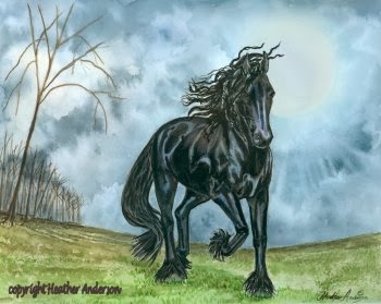
Maybe my biggest change has been my subject. For years, I painted almost exclusively horses because I simply, flat out, loved everything about them. Oh, I painted lots of dog commissions and set up at lots of dog shows with paintings of many breeds, but my imagination was filled with horses.
A funny thing happened as the years went by . . . more and more, I wanted to paint dogs, the loyal companions that sat beside me every day and snoozed beside our bed at night, sharing my joys and quietly offering the support of a damp tongue and a warm furry shoulder in my sorrows. I've always loved them, I've had a dog since I was a teen, and their warm, loving presence finally overtook my desire to paint horses. Dogs are now my main subject with a little room now and then for some cats and horses, and I'm happier with my painting than I've ever been.
Change can be difficult, painful at times, and it can catch you by surprise and be a huge challenge. But it can also lead you to a wonderful place where things are better than you ever thought they could be.
Cheers,
Heather
www.heatheranderson-animalart.com
These past couple of weeks, I've been posting images of Irish dog breeds on my Face Book page, and that meant going back to some note card designs I did a few years ago. But I'm getting ahead of myself.
Way back in high school, I went through a phase when I only wanted to work in black and white. I was hugely lucky to have had an enlightened and patient art teacher who let me go my dark way unimpeded. All he said was that one day I'd discover colour and that I'd never look back. Then one day, mid year, he sat down beside me and casually began to paint gorgeous colourful Japanese inspired flowers in watercolour. Naturally, I became hooked on these pretty, elegant images and wanted to do some too. He was right, I fell in love with colour and have never looked back. Thank you dear Mr. Lap.
Fast forward to art school and I found myself thrown back into black and white - ink work. I discovered the fun of it all over again.
Years later, when I was doing my note card collection, I did it in ink because I wanted to print them at home and we didn't have a colour printer. The cards were popular and I sold a LOT of notecards
Black Russian Terrier
But before long, I was craving colour again, and as colour printing had now become something I could do at home, I looked for a way that I could do the cards in colour without starting all over again. I had over a hundred images to consider! So I began to use a watercolour wash over the ink. I loved the look and so did my customers.
Welsh Terrier
I've been asked about using watercolour over ink . . . does it 'bleed', or run when the water hits it? The answer is not if you use the correct ink. I used to use an expensive Rapidograph pen that you need to fill with a good waterproof ink. But these pens are high maintenance and need to be emptied and the nib cleaned after every use. At that point, I wasn't into super maintenance of my art tools, and eventually I let ink dry in it, so it was a case of buying a a new pen. As my ink work was minimal now, I switched to a Pigma Micron pen and as it has waterproof ink, it worked out quite well. With this medium, you have to remember to let the ink dry thoroughly and to keep the watercolour to a light veil of colour, to let the ink show through. It has a light, bright look all it's own that I still enjoy. Many of these cards are still in my active file, so they have weathered the years well. If you decide to give this medium a try, I'm sure you'll have fun with it.
cheers,
Heather
www.heatheranderson-animalart.com
Watercolours speak to me the way no other medium does. I specialized in it -along with drawing - at art school, and I've been hooked ever since. I love the flow of the paint, the fluid washes of colour, and the brilliancy of the paint itself, especially when the bright, white paper is shining up through it. After all these years, I know it's tricks and idiosyncracies, and I feel very much at home with it.
I agree with what I've read and heard about the various colours. For the most part, the earth colours, the blues, and the yellows are quite friendly and agreeable, although the granulating colours within those groups can get a bit tricky. But the greens and reds can be bullies if you are not careful. Green can get over-GREEN or go acid very quickly if you are not careful, while red can get very heavy very fast, and it's also rather mobile if you accidentally sweep the edges with water, and you'll end up with colours running where you don't want them. True of any colour of course, if the situation is right, but I've had the most trouble that way, with red. Handled skillfully, these colours glow, and I am still working on getting a glorious, glowing red. Baby steps - red insists on taking baby steps.

With all the juicy colours dancing on the palette, it's tempting to boldly sweep it everywhere, but some restraint is necessary if you want your subject to stand out. You have to make a difference in the colour and amount of detail if you want any one thing to become the main focus. And the eye needs a place to rest - a place where the colour is quieter and the detail fades away. You want to dazzle the viewer, not blind them :D
I'm still working on these things and I always will be. There's always something new to learn and something you can do better. And isn't that GREAT!!
Cheers,
Heather
www.heatheranderson-animalart.com


